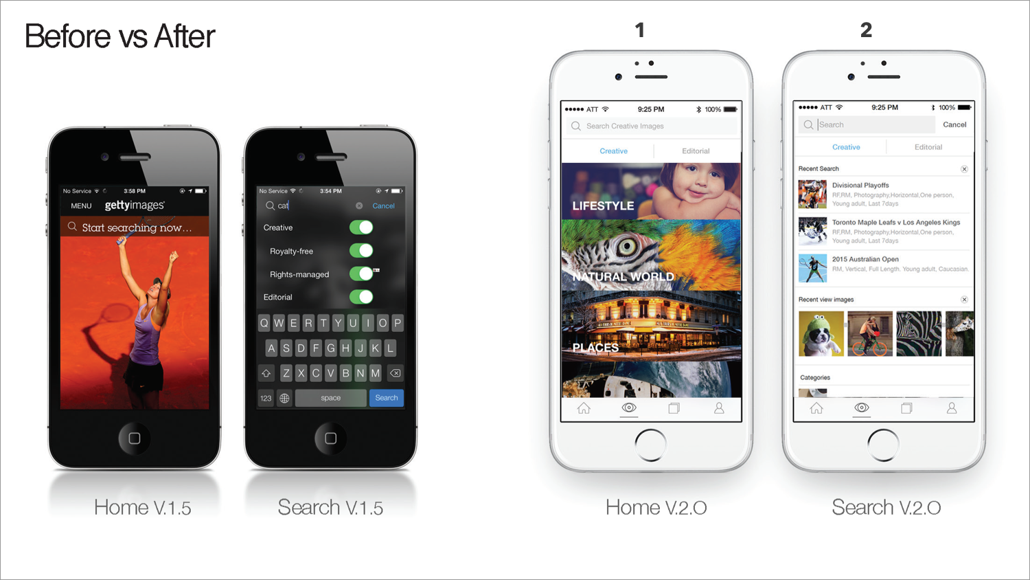
getty images

MY ROLE
I led entire redesigned two native apps (Getty images and istock) and one desk top app. Especially one of our desktop app its call ‘Getty images stream’ has been selected Best App of the year in 2104 by Apple.
Define objective, Information architecture, User journey, wireframes, prototype, user testing, high-fidelity mockups, execute, and analyzing.


LEARNING PHASE
We learned from our research that our customer doesn’t want to spend hundreds or thousands of dollar images from a small device including tablet, but they want to browse or search for their work if they can not access to their desktop.
As UX lead for this project, I wanted to focus how people want to use our mobile app as well as needs, problems, and goals.


IDEATION


I was responsible for developed the site map getty mobile app. It contains main pages and navigation of this project. I provided simple and easy site map to the team members, and to be able to communicate easily about structure and concepts, pages, objects, and flows.


CREATE A PROTOTYPE AND TEST


TOP FINDINGS
1. Filters need to simplified. Users struggle to cognitive load is stressed when on filters.
2. Users were easily adapted to search and browse experience. They liked to features ‘favorite’ which they can find an image later on a bigger screen to purchase.
3. It’s clearly communication separate ‘creative’ and ‘editorial’ categories on the browse tab.


IMPROVED AREA
1. Separated ‘creative’ and ‘editorial’ categories on the browse tab.
2. Recent search and recently view images which help our customer easy to find from their search history.
3. Search results page- it was showing on or 2 screen maximum from the old design, but new design you can see at least 15 thumbnail views which help people less scrolling and quick access to the tab for next task.
4. ADP- As minimalism design clean and easy to find related images make them keep browsing.
ITERATE & SHIP IT
Based on what I learned from the test, my UX colleague and I explored new experience for filters. The goal is to make clear and simplified to use filter option without cognitive loading information. (Mine is left one)
